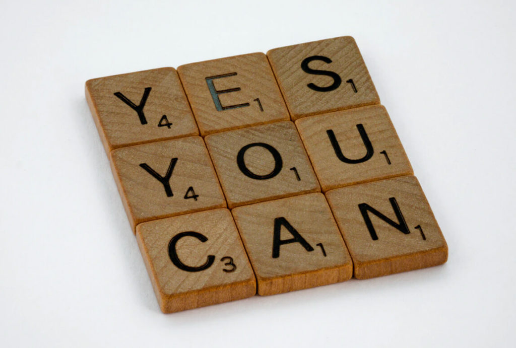
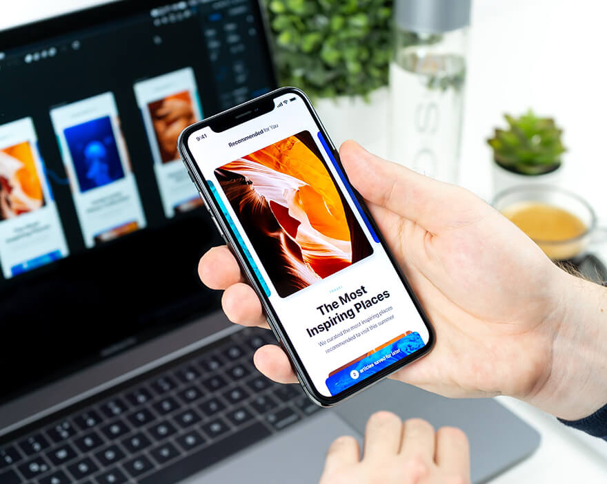
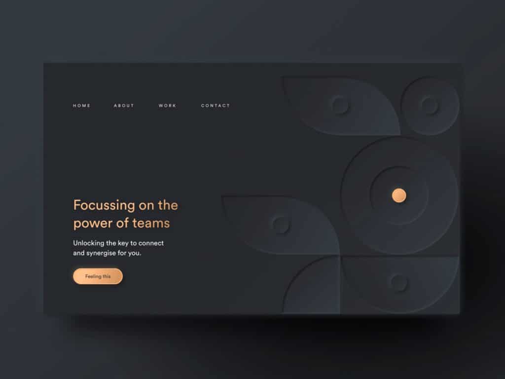
Hello designers! In this guide I will walk you through every step that will get you closer on becoming a ux designer. There’s no better time than now to begin learning ux design. After all, LinkedIn ranked it as one of the top 5 in demand jobs skills of 2020, with more and more job opportunities expected to open up each year.
This is a complete guide, that’s why I recommend you grab a cup of coffee and take notes. I know that you probably feel overwhelmed by the amount of information that is out there and you probably don’t know where to begin, that’s why I’ve curated a list of UX learning resources and some useful tips that I have learned over the years. Here’s a short note before diving in:
How do I become a UI/UX designer with no experience?
Just start out! Take it easy and don’t panic, you don’t have to know it all.
Danielle MacInnes
The fun fact is there are no shortcuts or any secret sauce that lifts you quicker than anybody else. You’ll have to be dauntless when you begin this wonderful journey, curious, and seek new challenging projects that throw you into the unknown, and that’s how you grow.
It takes a lot of practice, patience, and the most important key – your passion. Projects come and go, you will fail some and win many others. Dealing with criticism is another key aspect, but you will learn it the hard way. Hope not.
I know that most of you have your own fears and that’s okay, we’re all human after all. Here are some common ones I have faced and I know many of you resonate with me:
Nobody will hire me because I have no experience.
Why choose me? There are plenty of designers out there, better than me.
What if I’m not good enough?
I don’t have an affinity for this area.
Brett Jordan
You will find the answer to each one, by reading this article.
Due to the popularity of learning UX design, there are countless different methods of instruction available for students to use:
UX Certificates
Bootcamps
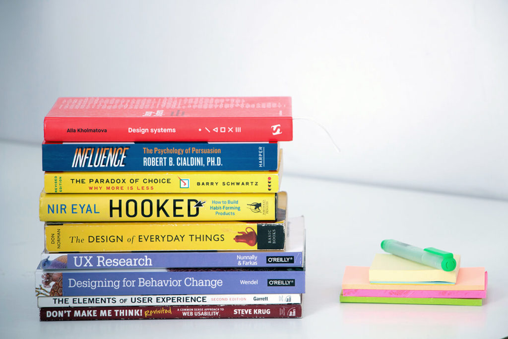
Books
Youtube Videos
Workshops
Tools to Master
With all of this available, it can be challenging to know the best method of how to learn UX design. We’ll take a closer look at some handy resources, here:
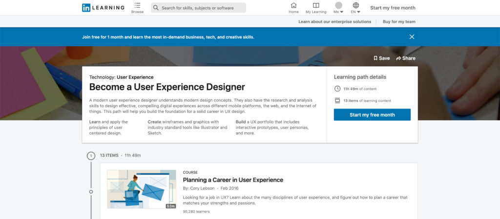
1. Get a UX Certificate
I think this is the most powerful way for you to get credibility in the eyes of employers. Usually, a certified course takes a few weeks and requires extra effort because you have to pass exams for each chapter and finally you will receive your UX certificate. It requires you to invest time, energy, and money, but this is the best investment you can make for yourself.
The only Bootcamp that I strongly recommend is IronHack. Here you will learn about design thinking, UX, research, how to master Figma and many others. It has many good reviews and it takes up to 9 weeks full-time or 24 weeks part-time without any previous IT background.
Key Points
If you are motivated by teamwork or in-person experience then this is the right place for you.
Once you pay this high amount, it forces you to go.
Gain practical experience by working on live projects and collaborating with other UX designers.
Be a part of a team that encourages the exchange of ideas and constructive criticism.
The career week is where you have access to a personal coach who can help you with your CV reviews, offer portfolio tips, and assist you in getting unstuck whenever you feel stuck.
Cons
Not for everyone because it is too expensive.
Don’t offer a UX mentor.
Too much emphasis on the UI side of things.
Don’t have a money-back guarantee policy if you don’t get a job.
The most effective way to learn UX design is to have a mentor who can guide you in your journey. Although, it’s important to have a strong foundation by taking a certified course, working with someone more experienced than you can provide valuable insights into problem-solving, brainstorming, performing user interviews, and conducting field visits.
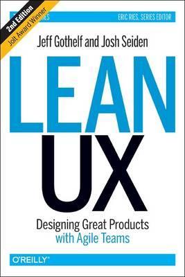
Jeff Gothelf and Josh Seiden – Lean UX: Applying Lean Principles to Improve User Experience
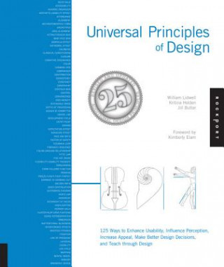
William Lidwell’s – Universal Principles of Design
Joel Marsh’s – UX for Beginners: A Crash Course in 100 Short Lessons
5. Youtube Channels
Many designers choose to learn from YouTube because it’s free and accessible. These YouTube channels are the best in my opinion because they are made up of teams of certified professionals who practice and teach people daily.
A handy way to absorb valuable information is through workshops. The guys from Dribbble host some cool ones on their learning page. They are quite expensive, but you get to interact and study with your favorite design leaders worldwide.
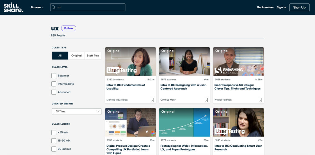
You probably heard about this one too. This is a good choice if you want to see live experts in action. Type UX in the search bar and you get tons of results. Starting from UX fundamentals to user testing and ideating.
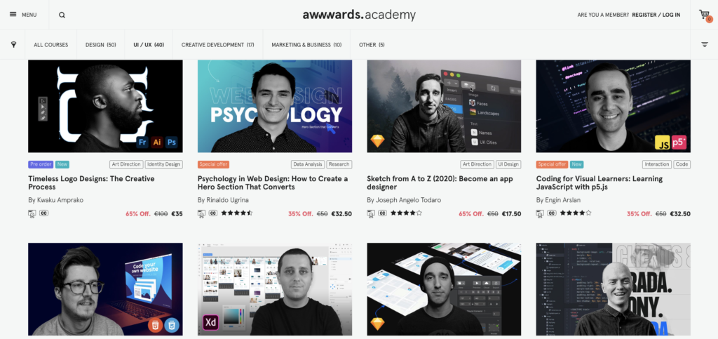
Besides the fact that Awwwards has been an authority in the design field for many years, here you can find ui inspiration, design articles, and of course amazing UX/UI design workshops. They also provide videos on how to animate your UI elements and create amazing presentations, so it is good also for the UI part.
7. Tools to Master
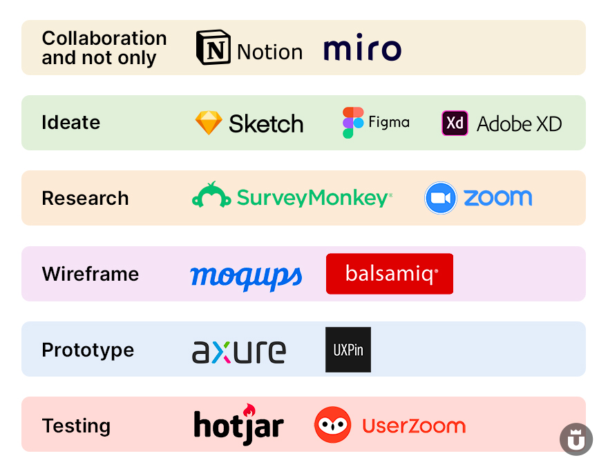
There are many great tools made by talented people and I apologize if I’m not mentioning some of them here, but I have chosen to work with these ones and in time I get used to them. I will strongly recommend to you guys the following:
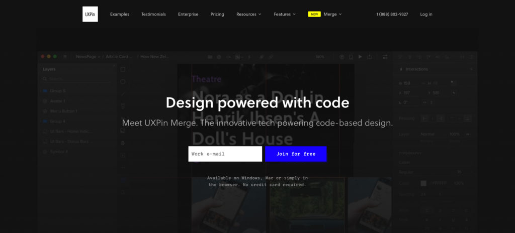
A very good tool that allows you to create simple and complex use cases based on high-fidelity prototyping. They’re providing a native design system/language all vector-based, so you can scale every component without losing its quality. You can collaborate with other team members. It is very complex and easy to use.
Enterprise software that allows you to prototype like a pro. It has very cool interaction attributes like conditions, triggers, and actions in order for you to build amazing products.
A complex tool that allows you to write, plan, and collaborate with your team. It’s very cool overall, I am using it for two years now and it helps me get things organized and be much more productive. It’s browser-based, so it is accessible to everybody.
A browser-based app that enables you to wireframe any idea. Helps you avoid any situation where your design gets rejected. I think any designer should start ideating using wireframes.
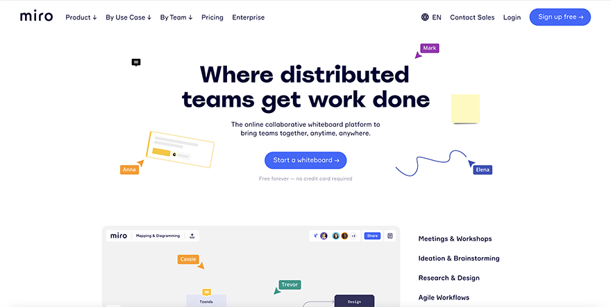
This one’s got a lot of attention lately. It is an online tool for collaboration between teams. From scenario mapping, strategy, and planning to brainstorming and ideation, this tool embodies the right amount of what you need. I strongly recommend it.
This app helps you do your research by creating surveys that enable you to collect data about your prospects and existing users. We all know how important this aspect is in UX design.
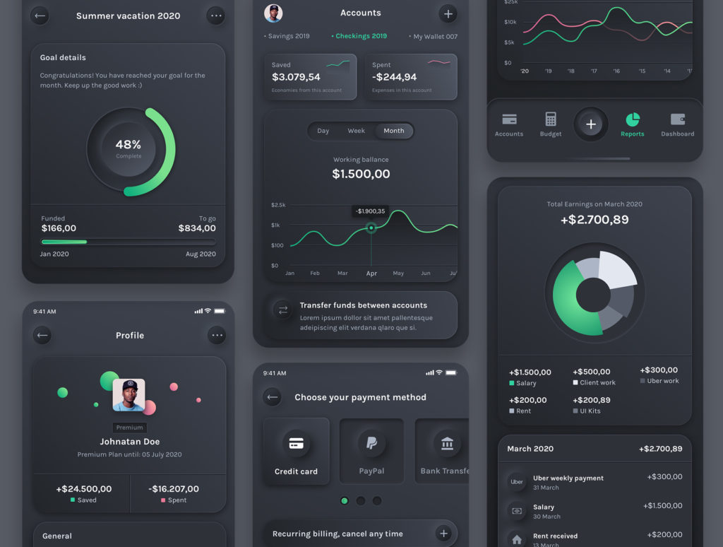
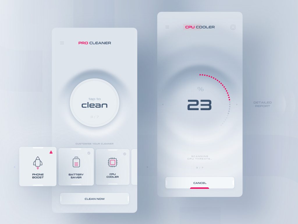
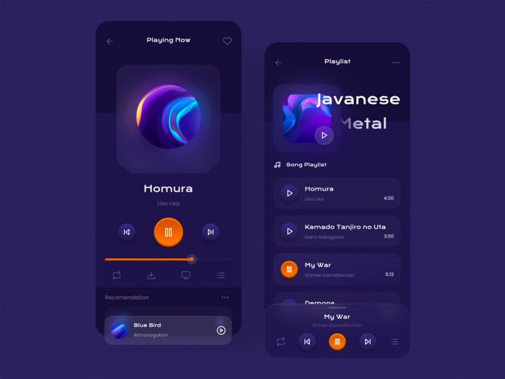
6. Practice UI Design
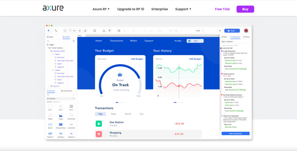
Neumorphic Finance App
Now, that you have a clear understanding of what ux design is, you won’t be able to go further with the ideating part of a project if you don’t know how to handle the art of ui design. But what exactly is ui design, and how is it different from UX design?
User Interface Design (ui design) is a subsection of User Experience Design (ux design). While UX is focused on the user’s overall experience, with a complex process that begins with stages like empathy, research and defining the problem, ui deals with structure and appearance, basic the actual interface that users interact with it.
UI without UX is like beauty without brains
Both UI and UX design elements interact with each other to create a positive experience for users.
You’ll have to embrace every stage of the process, because each one of them, is equal important no matter what the order is. You will have to gain insights and learn about the people you’re designing for, in order for you to be able to offer them a solution to their problem.
So, How Do You Learn User Interface Design? First of All, You Have to Learn to Observe Good Design.
Bookmark these Websites
How do you notice good design if you don’t have experience? My suggestion is to visit online community websites like Dribbble, Behance, Awwwards and pay attention to shots from the best designers in the industry. Try and do this on a daily basis.
If you take a look at any designer’s work, start from bottom to top. You will see that their first shots are not as creative as their latest ones, but with persistence, work and dedication their work becomes better. This is not going to happen overnight, but you will get there if you work hard and smart.
There are countless visual and structural elements that professional designers use in ui design in 2021. Some of the key features include:
All of these UI design elements need to come together to create one cohesive image. No single design element exists in a vacuum separate from other design choices when it comes to ui design. By learning the essentials of UI design and understanding aesthetic design, it’s easy to build up strong ui skills.
Master UI Design Tools
Creating the actual visual output requires for you to study the basic fundamentals of these tools. My favorite ones are Figma, XD, and Sketch.
For optimizing your design environment I encourage you to explore some UI kits, see how they’re done, and maybe create your own, so you can reuse them on multiple projects. You have to find the best practices that make your life easier, that’s why you should learn how to work with symbols, auto-layout, typography, styles, and so on.
I know that some people still work in photoshop 13, sustaining the idea that the design software represents 10% of the final result and the major part is coming from our creative brain. I agree, but let’s embrace technology and make the most out of it, especially if it reinforces our creative process don’t you think?
Replicate Other Designs
Daniel Korpai
If you are a newbie at user interface design, and you have just done some tutorials, if you don’t practice, you will forget everything you learned. Just pick some designs that you like on dribble and copy them as they are, to get familiar with your favorite design tool. Do this for a while and you will become a pro, you will know all the keyboard shortcuts and this is helpful if you want to accelerate your process.
Once you get to master a tool, just create or take some ready low-fidelity wireframes and apply a new fresh design, but this time without copying style from other fellow designers. Ask some experienced designers to express their opinions and suggestions about your outcome.
7. Less Theory, More Action
Clemens van Lay
Okay, now that you have a solid base, we can move on to the next step, the action phase.
When it comes to learning ux design in 2021, having a strong foundation in the fundamentals of ux theory is a good start. However, if you’re truly trying to effectively develop professional ux design skills, trust the age-old adage —“practice makes perfect.”
The most essential secret to learning UX design is to actively use everything you discover as soon as possible. In other words, don’t get caught up in reading too much and forget to hone your hands-on skills. Here’s a list of what you can do to obtain a job in the user experience field.
Join Online Communities
Find Instagram, Facebook, or any other social groups and seek out internships, or volunteer on small projects in order to truly develop your design potential. Ask designers to join you on their side projects as a coworker and you will gain experience and a chance to steal from them.
The main key aspect here is to seek work opportunities everywhere. Even if you are an introvert and this might sound uncomfortable as hell, you can ask for work on Linkedin for example. Make a post where you present yourself and your experience so far, emphasize your abilities, ask for help and make a promise.
Create Your Own Projects
KOBU Agency
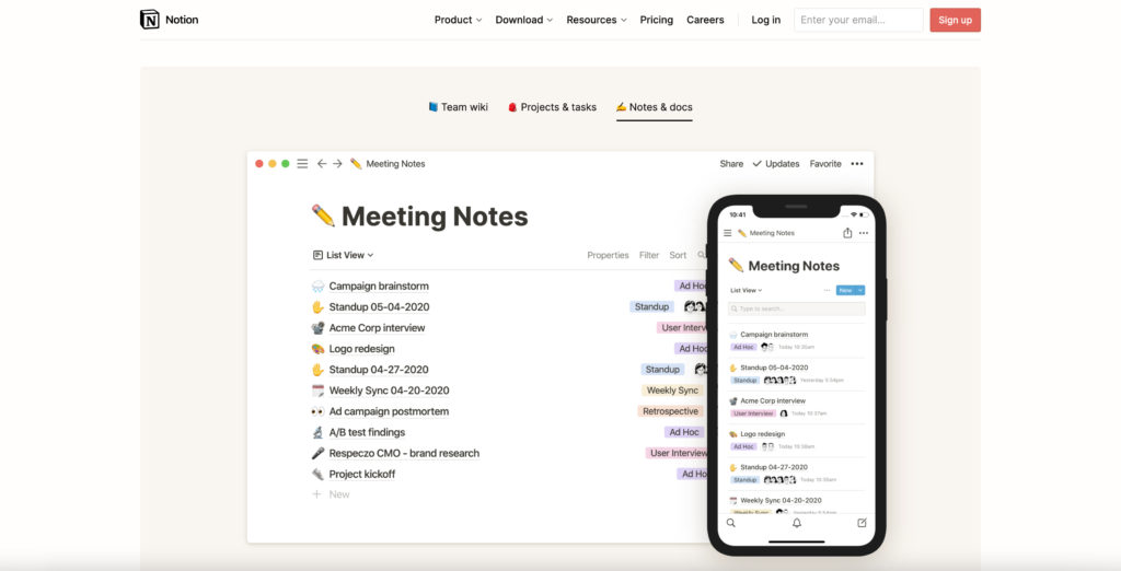
Find an idea and turn it into a UX project. Let’s say you want to build a fitness mobile app that helps busy people eat better and exercise. It all starts with empathy. Open the Notion tool and write down questions like: Who are these people? What are their struggles? Why do they lose motivation?
Do your research. Go to Google Play or Apple Store and search for competitive apps and see users’ opinions. Make two lists; Complaints and Nice to Have and fill them out under each one. And you keep going with the process of user experience design, and after you have the wireframes of each use case then you start the UI design.
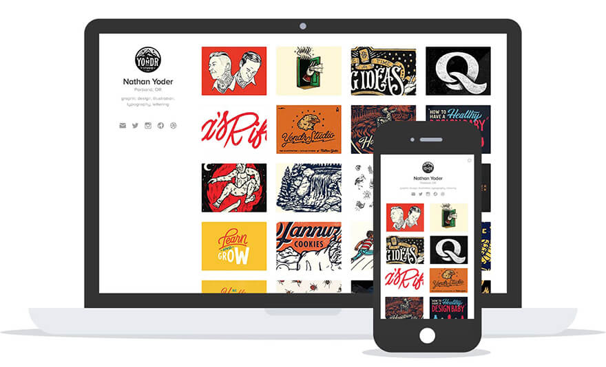
Build Your Portfolio
Dribbble PlayBook
A valuable resource that will help you book more jobs as a ux designer is your portfolio. Therefore, all beginners and student designers must initiate developing their portfolios as soon as possible. Create a Dribbble or Behance account and add projects like I mentioned above, to it.
Additionally, don’t be afraid to reach out for feedback from other ux industry professionals. Seeking out weak points in your design may seem painful, but can overall improve the quality of your work. After all, it’s better to get constructive criticism from friends and mentors, rather than from clients, in order to help you learn more about ux design.
Final Thoughts
Learning UX design is an endless process – there will always be more things to learn, apps to develop, and challenges to overcome… but that’s precisely what makes learning UX design so rewarding. Above all, beginner UX designers should actively pair learning the basics of UX design with hands-on experience to accelerate their progress.
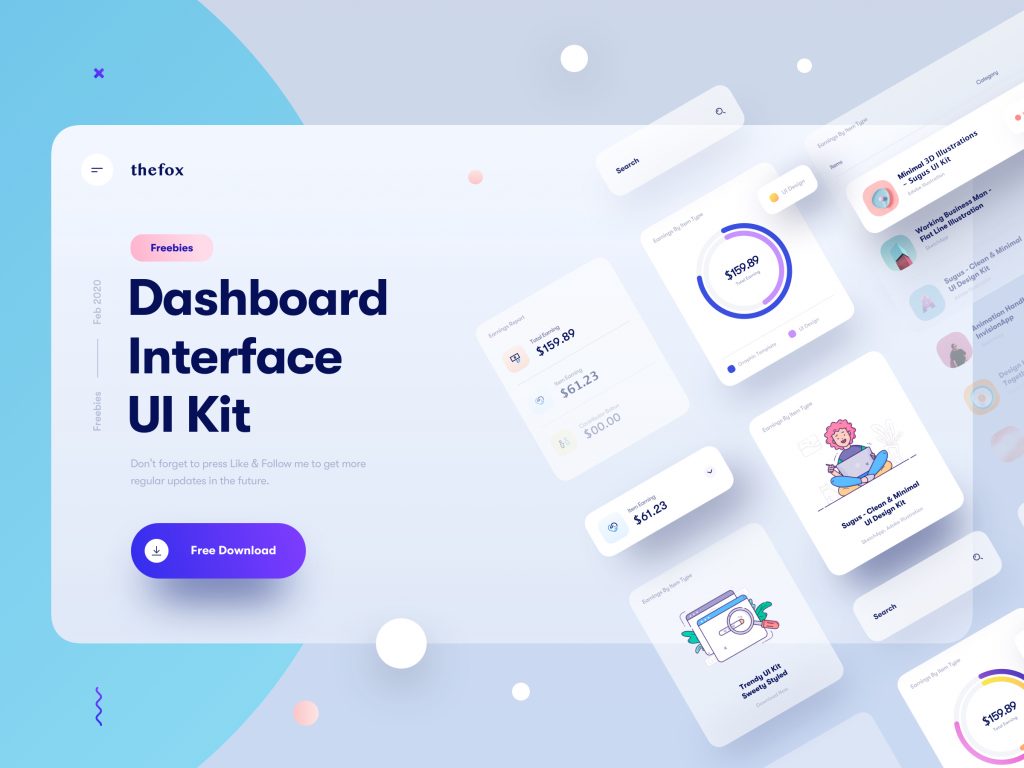
Get started on putting your practical design skills to use with our premium ui kits that give designers everything they need to creatively and effectively complete new projects for their clients!
What are your struggles when starting a career in UX design field? What would you add to the list?
If you enjoyed this article or find it useful, please share it so more people can benefit from it. Have questions? Write us at [email protected].
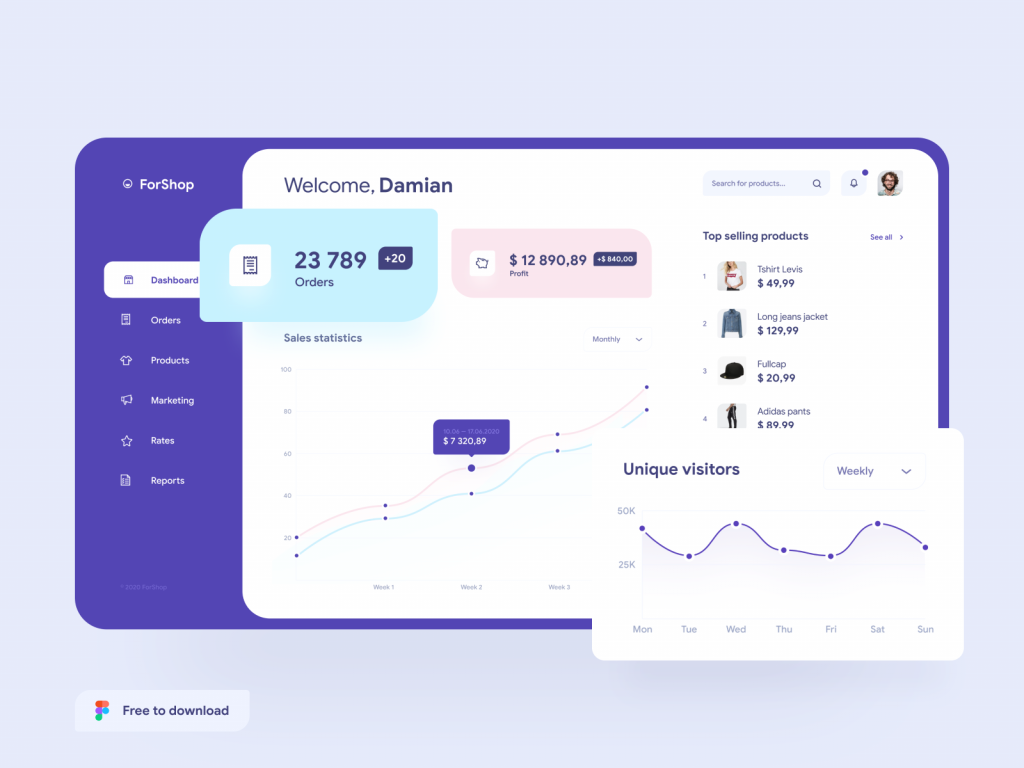
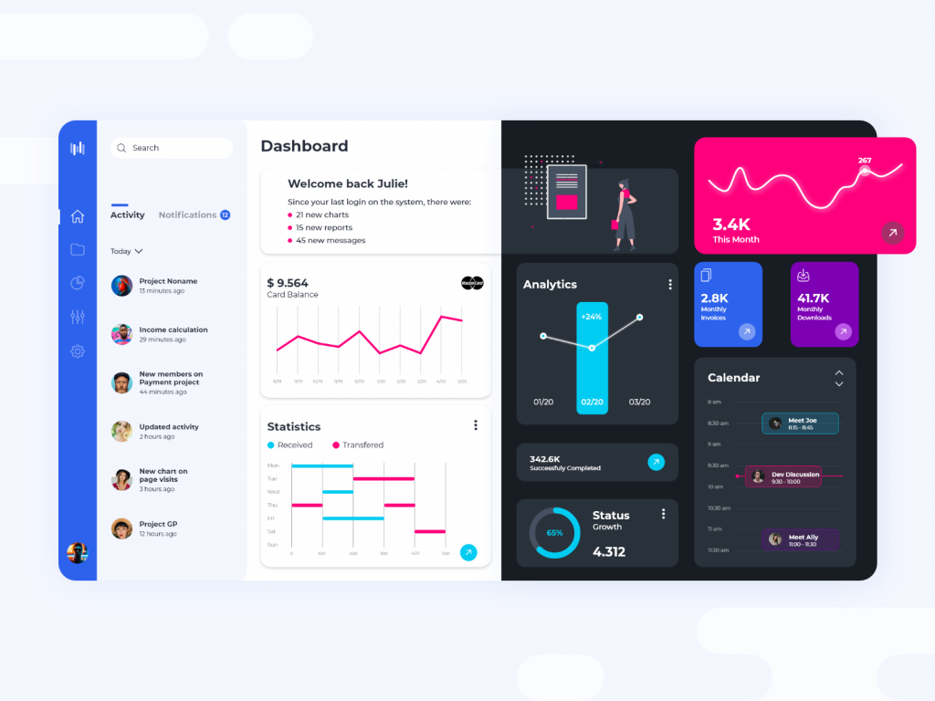
We all know how important nowadays is to design an amazing usable dashboard for our clients. First things first, we should take a deep study and get to know the users will designing for. Usability should prime, but in the same time we have to maintain that clean and modern look and feel. Keep reading.
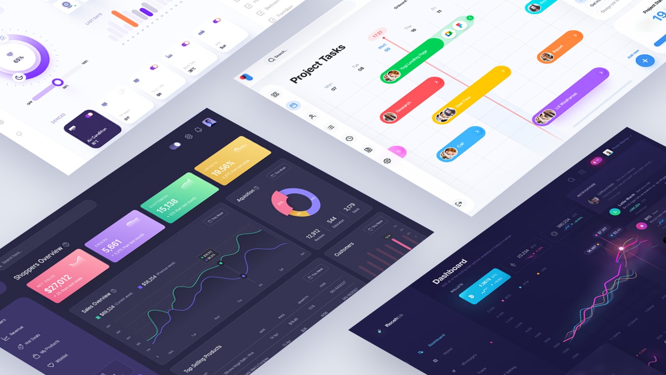
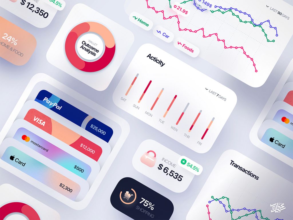
A dashboard or an admin panel is a dedicated interface/page of an web/mobile app that contains structured numeric data that clarifies the current/past situation of a business. Very pleasing to the eye, all the data is shown through the help of graphs and charts that depicts a very professional look & feel.
What makes a good dashboard UI?
A well designed dashboard is not crowded with all sorts of graphical elements that serve no real purpose, but it offers a very clear way of displaying data that help people make fast business decisions.
1. Consider Usability Over Aesthetics
Creating a dashboard UI is a preferred assignment for designers because of its intricate nature and the assortment of graphs that can provide a stunning impact. Nonetheless, it can become chaotic if numerous colors and widgets are included, making it difficult to know where to focus.
Initially appearing as a sophisticated and business-oriented appearance, it has now transformed into a disorganized interface, hindering users from efficiently scanning and comprehending their business status.
Here, I will not provide an example because I don’t want to cause harm to any designer.
2. Use Flexible Date Ranges for Every Widget
A crucial part of a designer’s act is to get insights into the real needs of those who will absorb the data. If you look at Google Analytics, you may observe that every statistic gets updated when selecting the desired time period.
That is a key feature that you should take into consideration when building an admin panel. Simplicity is another crucial aspect that you should count on.
3. Implement Interactive Features
How effective is the Stripe dashboard? It enables us to explore different widgets using tabs for data access and features a bar at the top that lets us view information within specific time frames.
4. Choose the Right Chart Types
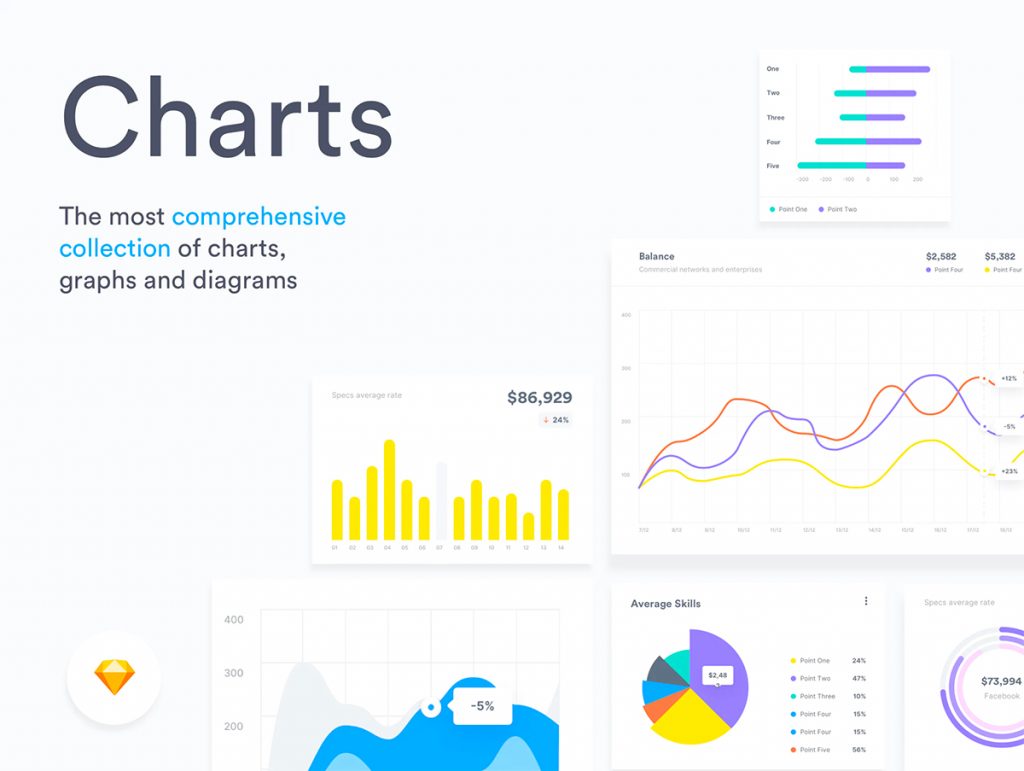
Many designers use sophisticated charts that people find hard to read and understand. A good admin panel uses appropriate chart types to effectively present the data, with bar charts and line charts used to show trends over time, and pie charts used to show the distribution of data across categories.
This example from Monday is a good example.
5. Provide a Clear Visual Hierarchy
The contrast between small and huge typography used on values and labels creates another cool effect that helps people clearly see what’s important. In the Gumroad example, it is very clear that figures or KPIs are displayed in large font sizes. How clear and simple right? Keep that in mind when designing an admin panel.
6. Cover Design Solutions for Empty States
There are two types of users, existing and new, so make sure you offer realistic design solutions for each one. Not all charts are fancy and catchy in the case of a new user who just registered. I know what developers will say: “This type of chart cannot coexist in the real world.” Be prepared and cover all scenarios.
7. Effective Use of White Space
The Youtube dashboard is a good example because it uses ample white space to create a clean and organized layout that is easy to read and navigate. If you look at the left sidebar navigation menu you see that links are not vertically glued to each other and the selected link is very clearly presented with the use of the red color.
A Simple Advice. Keep Designing
It takes a lot of practice until you succeed in creating an effective one. Meanwhile, then you have to practice every day and be willing to face criticism. Step out of your comfort zone and become the best designer you can be. Start with these dashboard freebies that will energize your creative process.
List Dashboard Ui Design Templates Free
If you find yourself lost in this noisy world of creative shots and you don’t know where to look, we expertly curated a list with the most modern dashboard UI freebies for Figma, Sketch, and AdobeXD that will boost your creativity in 2024.
1. Dashboard Interface Elements by Tran Mau Tri Tam
We all know Tran and the awesome design style that he has given us over the years. This dashboard UI kit comes in a very modern style with all sorts of playful illustrations, vivid gradients, and bold typography.
This admin panel describes the economic state of a company through an earning report and analytics of an actual month.
What’s inside?
An organized sketch file filled with 14 cards including:
Header
Radial graph
Table
List of earnings
Search bar
Others
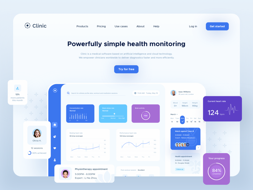
2. Clinic UI Elements by Juliette Lagache
If you’re working on a medical UI project for one of your clients this dashboard UI template definitely comes in handy. The actual work is thoroughly organized in layers, and symbols and all the components are very well presented.
The design is divided into three columns or views and is unique because Juliette applied huge round corners on every element you notice. The blue-colored sidebar with just icons as links and the way it combines with the light blue background of the artboard really gives an original aspect.
What’s inside?
A sketch file containing two artboards. One with the actual dashboard template and the other with the UI elements. Resizing constraints feature is applied to every component. You will find cards like:
Bar Graph
Slider Graph
Gauge Graph
Line Graph
Calendar
Progress
Vivid color backgrounds
User profile
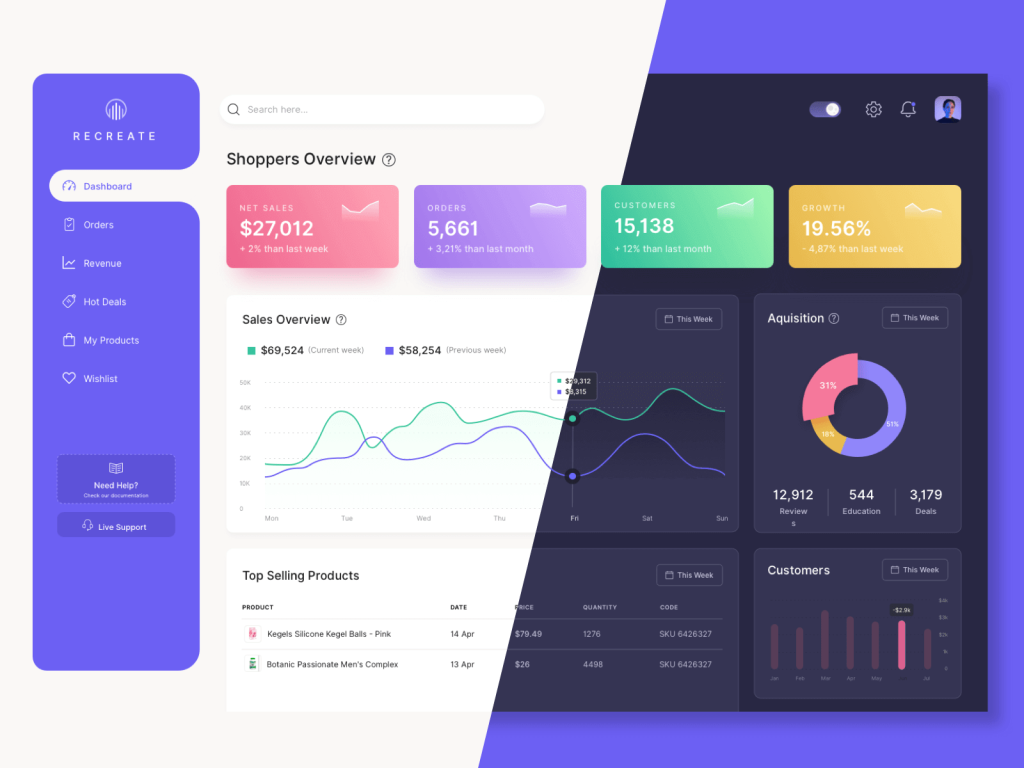
3. Recreate Dashboard UI Kit by Premiumuikits
How can we not contribute when it comes to dashboard UI kits? Recreate user dashboard template comes in two themes light & dark and it is very to use because of its simplicity. As you observe we made it more colorful especially on the top part because that is the most important aspect of an admin panel.
We decided to make the sidebar background color less vibrant in the dark mode because we wanted it to stand out as little as possible. Prioritizing usability over aesthetics and emphasizing numbers, which reflect a company’s current or previous situation, are key to success.
And now to brag about ourselves a bit, we love how we did the selection part from the sidebar :)). We think it is cool, what about you?
What’s inside?
A sketch design file with two artboards, one for light and one for dark, and a pdf file with instructions.
Playful gradients
Fonds from where you can change the value of the radius
Graphs – line, radial, barTable
Switch
User profile
Sidebar
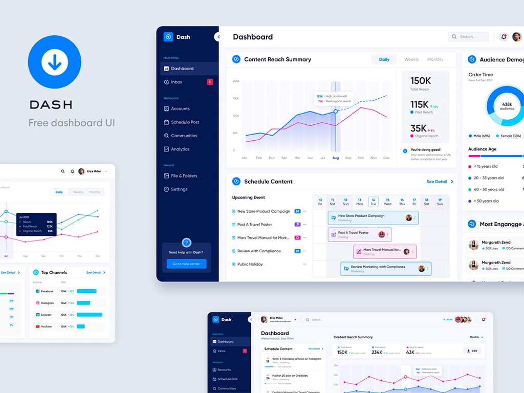
4. Dash – Free Dashboard UI Figma by Bagus Fikri
Please welcome to this complex dashboard ui kit made in Figma that offers a lot of possibilities. You can customize it with ease and is really very helpful because it contains a lot of widgets.
Many companies look for an enterprise look and feel nowadays, and this free dashboard UI concept is very realistic and adapts to many user flows. Every layout has a unique arrangement and it enables designers to create powerful dashboard UI designs for their upcoming projects.
What’s inside?
One design file with
Three Figma artboards
Huge typography for numbers
List of customers’ card
Schedule card
Upcoming events card
Audience demographics card
Outlined icons
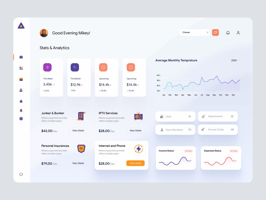
5. Personal Dashboard UI Kit by AR Shakir
If you want to manage your finances, this dashboard UI template kit is the right amount for everything. Shakir used the white space in a smart way, that depicts a clean aesthetic which allows the metrics to stand out.
The structure of the layout is quite exclusive and we can get into details. As we look the sidebar navigation menu is very thin which conveys a wide real estate and the content is very well presented.
Having a budget doesn’t mean that you are restricted with your funds, but it enables us to track the expenses to see where our money actually go.
What’s inside?
Two design files are compatible with Figma & XD.
Custom icons
Line graphs – 100% Vector
Modular components
Easy to customize by changing UI styles
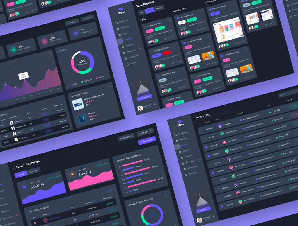
6. Wons Admin by teamUXD
A great resource that will help you start your future dashboard ui designs with plenty of options from which you can choose. Wrapped in two themes, this free admin template covers a lot of user flows.
The overall user experience is so meaningful and each screen is basically a user flow. Whenever you’re stuck and don’t know what a particular screen should look like, you can get your inspiration from here.
What’s inside?
One design file made with the Figma tool
Themes: Light & Dark
Screens: 24 Desktop Screens
Fully customizable
Auto-layout
7. Profile dashboard XD freebie by Zhenya Karapetyan
This awesome profile dashboard ui kit can boost your inspiration and reinforces your creative process when it comes to designing social media projects. Zhenya went above and beyond and designed a very creative template.
The aspect that makes it unique is the rounded corners. If you look closely, you’ll notice that each card has three round corners and one straight.
The colors are on the same spectrum, which brings consistency across the entire layout, and we the usage of some fresh sophisticated ones creates a modern environment.
What’s inside?
An Adobe XD design UI file that contains the analytics of a user profile
Sidebar menu
Fonts used: Lora & Proxima Nova (install these first)
Graphs: Radial, Bars, Simple Line
Huge typography
User profile
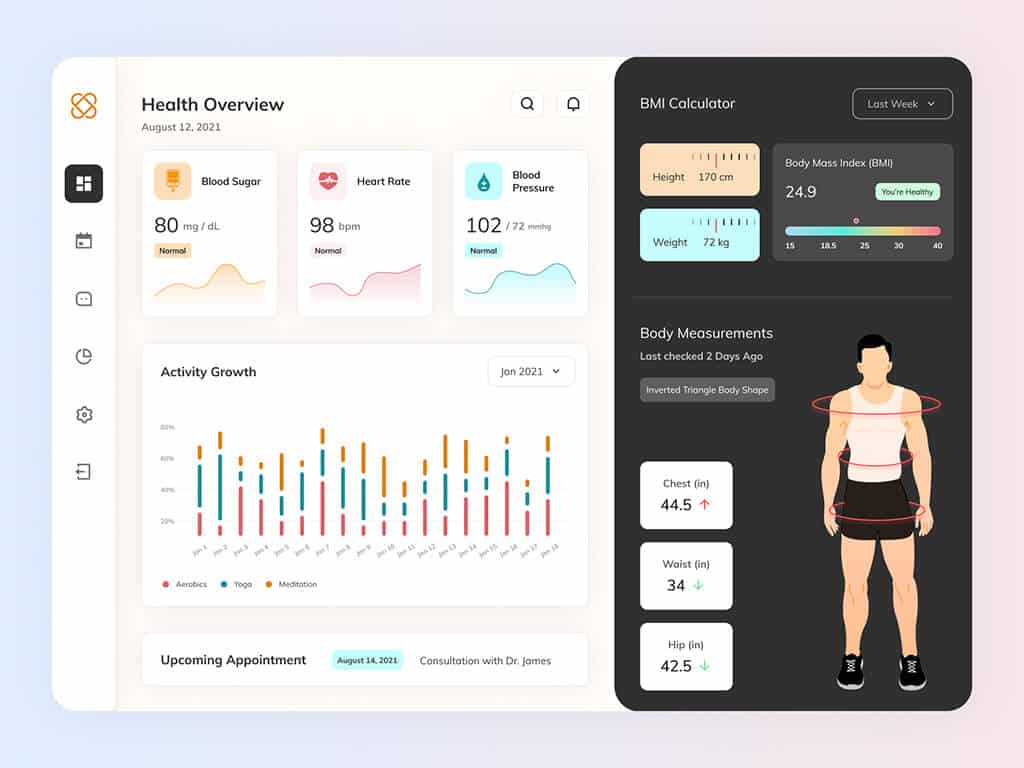
8. Healthcare Figma Dashboard by Yugal Mahajan
Moving on with another dashboard UI design from the healthcare industry that will help people take care of their well-being. The layout is interactive due to the human body illustration from the bottom right that visually displays our body measurements.
The icons are so simple and cheerful, and the use of color helps us distinguish between the different health categories.
What’s Inside?
A design dashboard compatible with Figma
Fonts used: Mulish (install first)
Graphs: Bars, Lines
100% Vector Illustration
Playful Icons
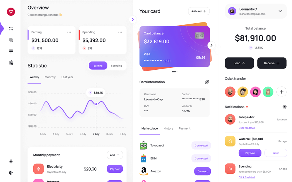
9. Free Figma Dashboard Wallet UI Kit by Muftagi Arm
A very modern, playful dashboard UI design that offers us many possibilities. The payment cards are so cool that you can use them on your finance UI projects.
Everything is amazingly well colored, especially the avatars from the right. You cannot get bored looking at the entire layout, isn’t it?
What’s inside?
A design dashboard compatible with Figma
Fonts used: Manrope (install first)
Graphs: Lines
Payment cards
Playful Gradients & Colors
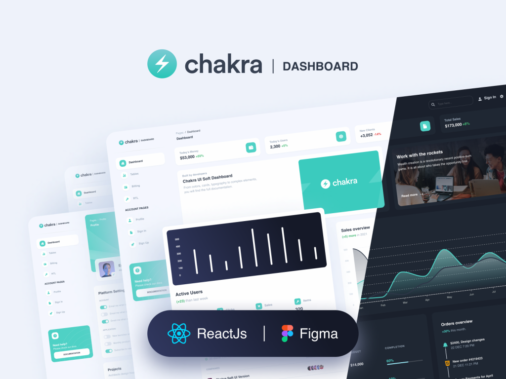
10. Purity UI Dashboard by Creative Tim
Sau hello to the Purity Dashboard Template that will save you time, energy, and money. It is based on the Chackra Dashboard UI Framework, which is a comprehensive solution that contains hundreds of elements that you can alter at will.
In addition to receiving the Figma design file, you will also receive the coded part written in Javascript based on React framework, thus providing you with a ready-to-go tool that will enable you to build fantastic websites and dashboards templates at the speed of light.
The look and feel are more corporate thanks to the contrast of dark grey and bright cyan. It has two themes Dark and Light with different layout structures. Special thanks to CreativeTim for this awesome design UI freebie.
What’s Inside?
Code in (Html, CSS & React)
RTL support page
Dashboard
Tables
Billing
Profile
Sign In
Sign UP
11. Free Dashboard Web App Template by Panoply Store
Another spectacular dashboard admin panel ui from the guys from Panoply Store. Clean & organized this freebie comes in two themes, light & dark, all compatible with Sketchapp, Figma, Photoshop, and Adobe XD.
The layout is well balanced with a high contrast that makes the primary and accent colors stand out as they should. A professional approach that you should take into consideration when designing for two themes is the fact that the colors in the dark mode are a bit brighter than in the light..
What’s inside?
Lots of components
Dark and light mode
Elegant & stylish design
Fully customizable
Scalable vector & free fonts
Meticulously layered
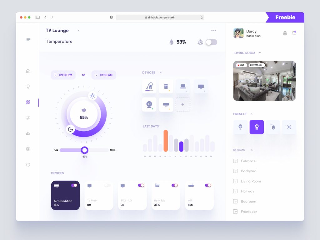
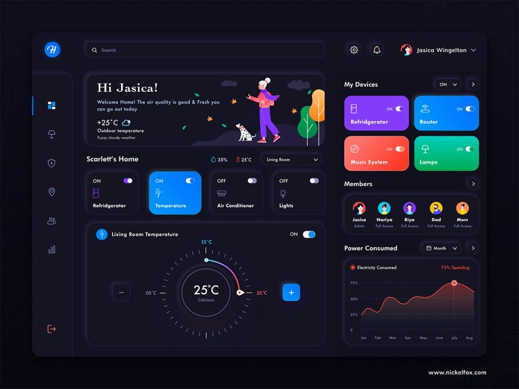
12. Smart Home Dashboard by AR Shakir
As technology evolves so does design and Shakir’s dashboard UI freebie might come in handy if you plan to develop a smart home app for your customers. Setting the temperature of your air conditioner, reducing energy, or controlling your devices from a distance is very useful these days.
Regarding the design style, this user interface is very well made with just a few shades of light grey, subtle shadows, one primary color, and an accent one. Of course, there are a lot of details that go into the whole interface, but keeping it simple gets hard sometimes.
What’s inside?
One design file with one artboard
Compatible with Sketchapp, Figma & XD
Clean & modern ui design
No Symbols
Fonts – Helvetica (you should install first these so you can see them)
Meticulously layered
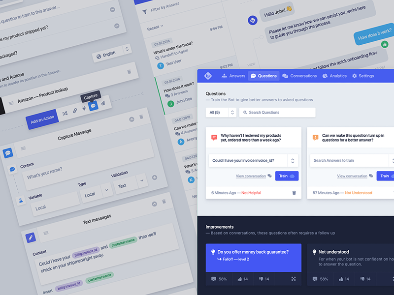
13. Chatbot UI Kit by Kasper Christensen
Chatbot UI dashboard kit is more than just a freebie, it’s a complex design asset made in Adobe XD containing three artboards from which you can inspire. It addresses the field of virtual assistance using chatbots.
We downloaded this ux goodie and we loved what we saw. A very professional design grouped in layers, well balanced, having lovely colors that depict professional aesthetics.
What’s inside?
A design file compatible with Adobe XD
Three artboards covering three links (Answers, Questions, Conversations)
Symbols – NO
Fonts – SF Pro Display (install these first)
100% Vector
Filled Icons
Follow Kasper Christensen for more freebies.
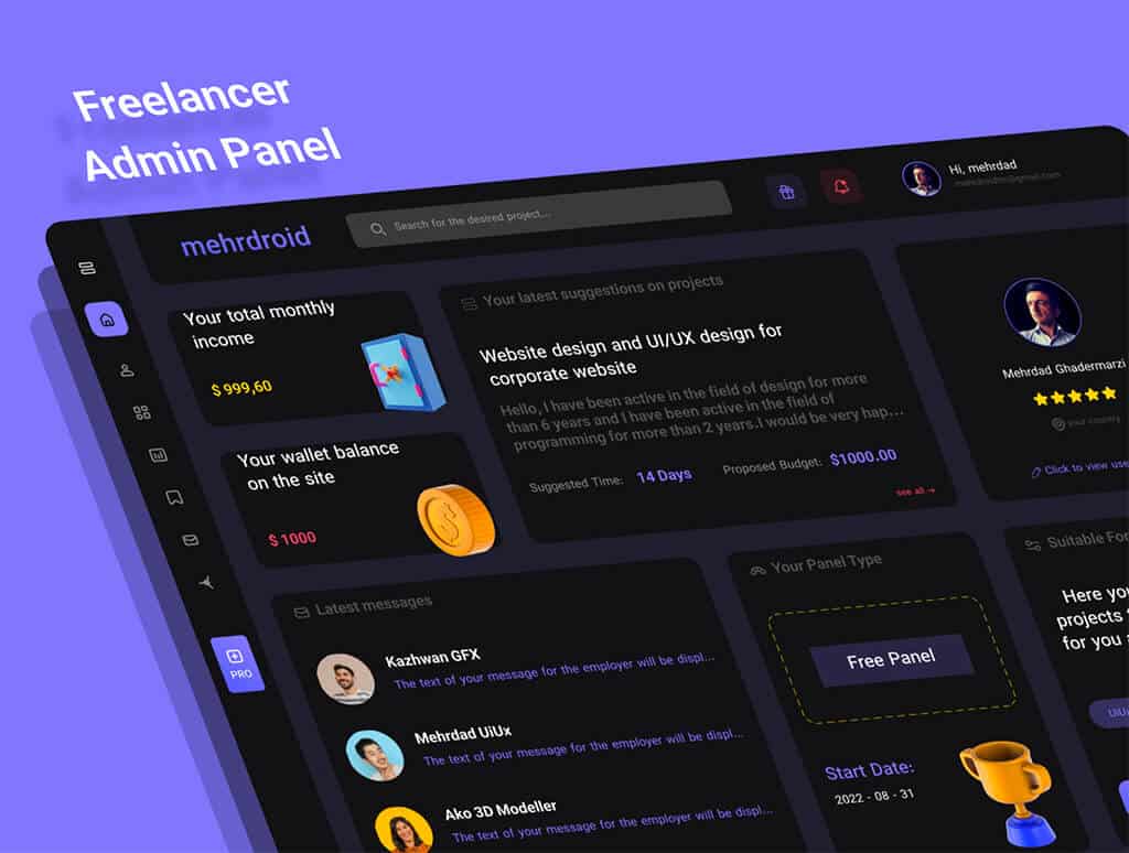
14. Freelancer Admin Panel by mehrdroid
Modern, clean, and free dashboard UI design targeting the project management area is compatible with Figma. The work is well-balanced with 3D icons, typography styles, color variables, and lots of icons.
You can download it and start ideating dashboard UI projects faster and more efficiently.
What’s inside?
Design file compatible with Figma
Theme: Dark
Fonts used: IRANSansX family
Style guide included
15. Dashboards Free UI Kitby Craftwork
A complex, professional UI dashboard containing fifteen artboards compatible with Figma and Sketch, made by the amazing team from Craftwork. It has lots of widgets from calendars to progress bars, graphs, and more.
We have to be honest, but this is the most professional dashboard freebie on the entire list. You should download it, see how it’s made, and start designing it for your future projects. It reduces your time dramatically and it will help you gain valuable design insights.
What’s inside?
15 ready-to-use templates
Basic icons pack
18 widgets with graphs, charts, and stats.
Typography styles
Easy to customize by updating symbols
16. Free Dark Crypto Dashboard by Zazuly Aziz
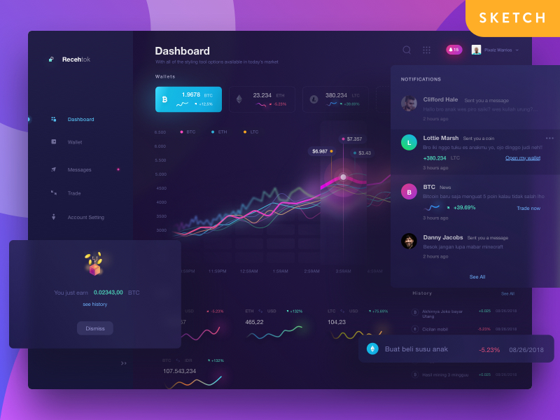
A beautiful dark-themed cryptocurrency dashboard with glowing and blurred effects is what RecehTok is all about. A recent update indicates that Aziz made this dashboard compatible with Figma and he did his best and created the light version as well.
This dashboard design can give you inspiration if you want to design beautiful line graphs. You can install it with one click by duplicating it in Figma.
What’s inside?
One file compatible with Figma & Sketchapp
Sidebar
Notifications
Popup
Wallet Graph
Coins Stats
17. Cryptocurrency Dashboard Redesign by Carlos Han
A well-structured and balanced dashboard freebie that will help you energize your creative process when it comes to cryptocurrency projects. The candle line graph is the largest component on the page you can copy and paste it on other projects without creating it from scratch. You just customize it and you have a complete design widget.
The sidebar part is very useful because it contains nested categories and indented links that offer you many possibilities. Just grab it and play with it.
What’s inside?
A well-structured Sketchapp design ui freebie
Lists
Graphs
Table
Header
Sidebar
User Info
Search
Nested Nav Menus
Newsfeed
18. Orion UI kit by Alien Pixels
Dark and spectacular, this cool dark dashboard UI freebie is compatible with Figma and is very well organized with artboards and modular components wrapped in ready-to-use symbols.
19. Online Courses Dashboard by Bogusław Podhalicz
Welcome to this black & white funny dashboard design that will help you get inspired if you want to apply a friendly design style to your future projects. The design is made in Figma and it has a very powerful contrast due to the dark sidebar, buttons and typography, and white background.
You can duplicate it to your drafts and start exploring it. Clean and well organized you can use it, especially if you want to develop dashboard templates from the area of the online courses.
What’s inside?
A unique sidebar full of icons as links
Fonts – Baloo Bhai
Illustrations
Tabs
List of courses
Search bar
Statistics – line graph
20. GameNite Free UI Kit Sketch by Bartek Zieman
GameNite is a free admin panel that provides you with the capability to buy and sell items using blockchain technology. This dashboard UI freebie has seven artboards all wrapped in dark mode with lots of symbols and styles that you can easily construct and customize.
This design freebie is very complex with many widgets and components which you can use in your future projects.
What’s inside?
A design file compatible with Sketchapp
Typography styles
Symbols
Graphs (Line, Bars, Candles)
Tables
Gamer profile
21. To do dashboard by Bogusław Podhalicz
A clean and colorful design dashboard template that was designed with the aim of making completing tasks simpler and more fun. These colors are so well picked that we cannot get bored looking at them. It helps us distinguish the status progress of a task with ease.
The user experience is made up of a user flow that tracks the progress of employees in an organization. Grab it and use it for your upcoming design projects.
What’s inside?
One Dashboard ui design Figma
Light theme
Outlined icons
Typography styles
Fonts used: SF Pro Display
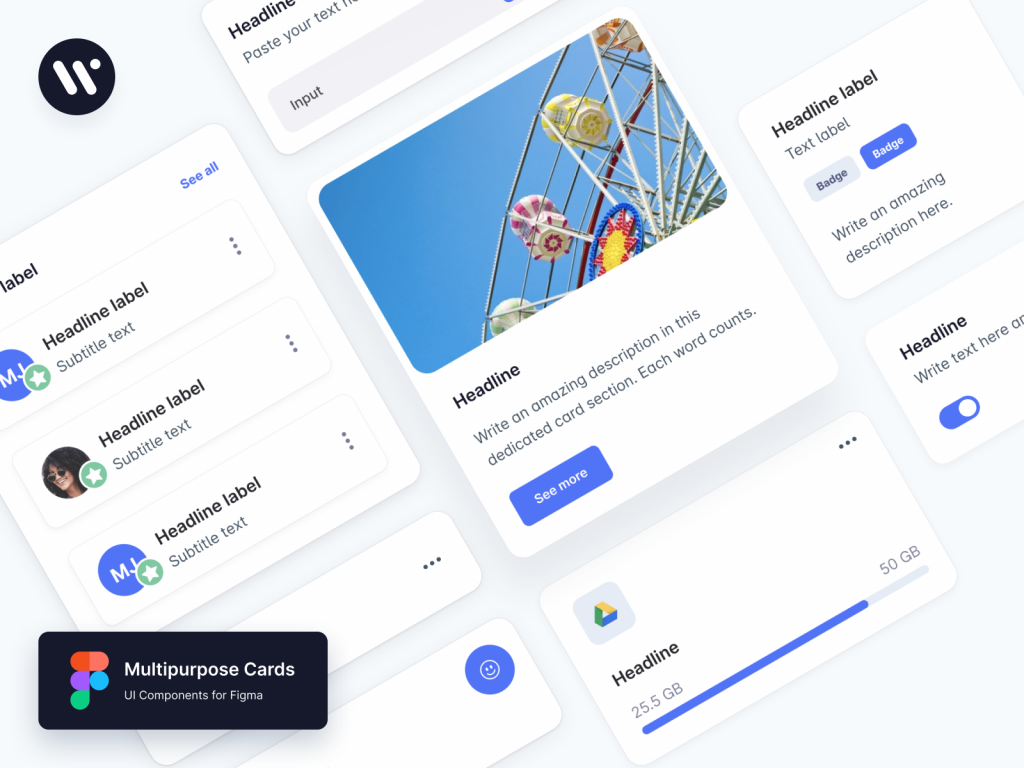
22. Multipurpose Cards by Webpixels
Another useful design freebie made by the guys from Webpixels. This file contains two artboards one called Components (containing eight cards) and one Buttons.
The design itself is very well executed with features like resizing constraints, variants, and typography styles from which you can benefit and accelerate your creative workflow.
Probably one of the best design freebie templates on the list we encourage you to take a look, see how it’s made, and learn from the best. Apply these rules to your design projects from now on.
What’s inside?
One design file compatible with Figma
Cards
Buttons
Fonts used: Inter
Resizing constraints
Auto Layout
Variants
Color Variables
23. Taders Social Network by Grégoire Vella
A super clean dashboard admin panel UI concept representing a social network experience for traders and investors. You will find a sketch file that covers a lot of things like transactions, lists, user profile info, sidebar navigation menu, and so on.
Typography is well hierarchized with dark mauve color. The borders are very subtle and they delimitate the entire layout in a useful manner.
What’s inside?
One design file compatible with Sketchapp
Two artboards
Bar & line chart
List of transactions
Top stocks
Fonts used: Sofia Pro
24. Ecommerce Dashboard by Bartosz Maryniaczyk
A fresh new creative approach is brought by Bartosz Maryniaczyk with this amazing eCommerce dashboard UI kit compatible with Figma. This design story relates to the current situation of a seller.
This sketch dashboard freebie has a high-quality dark design with vibrant gradients, making the devices stand out properly.
What’s inside?
A design file compatible with Sketchapp
One dark artboard
Fonts used: Muli
Outlined icons
Graphs: gauge-radial and line
Fully vector illustrations
26. Finance Dashboard by Siamak
This small UI kit has a few powerful components that you can scale and customize as you want. The work is made in Sketch and it is carefully layered and organized. The font used is SF Pro Display and before you open the file make sure you have this installed.
Siamak took into account resizing constraints when he designed these wonderful graphs and cards, hence we can resize and customize them as we like.
What’s inside?
One design file made in Sketchapp
Fonts used: SF Pro Display
One line chart
Bar chart
Payment credit cards
27. Charts by LS.Graphics
Creating stunning graphs, diagrams, or charts from scratch can be time-consuming. A creative dashboard UI requires well-designed graphs that visually communicate the metrics of a particular time period.
The team behind this design file has thought of everything. Thank you, Ruslan Latypov. You can use these resources for personal, non-profitable, or commercial projects. You don’t have the right to resell them.
A complex admin panel design template, XdDash will help you create various dashboards and variations by combining various customizable elements. Everything is grouped as a component in Assets, so you can change the colors with one click if you want.
The design file is neatly organized having all components grouped into separate artboards. Zvonimir also provides instructions on how to use it, so you can create powerful dashboards.
What’s inside?
One design file made in Adobe Xd
Eleven artboards
Color variables
Typography styles
Icons
Charts
Cards
Various widgets
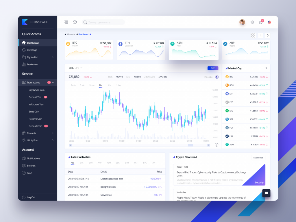
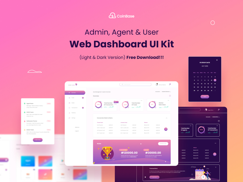
29. Coinbase – Web Dashboard UI Kit by Cr8tiv Emmy
This huge group of 72 responsive screens that you may play with and create your very own dashboard UI admin panels is free for Sketch, Figma, and XD. The dashboard UI light and dark modes will stimulate your imagination and refresh your vigor.
This eye-candy dashboard UI freebie is suitable for Photoshop and it has a unique ui style due to the wave graphs at the top and the transparency of the cards.
We suggest downloading these dashboard UI design freebies and examining how they’re constructed. Some of them are expertly designed with modular components that assist us to create at scale. We will continue to inspire you with modern, fantastic UI designs so you can strengthen your imaginative process for your personal projects or commercial use.
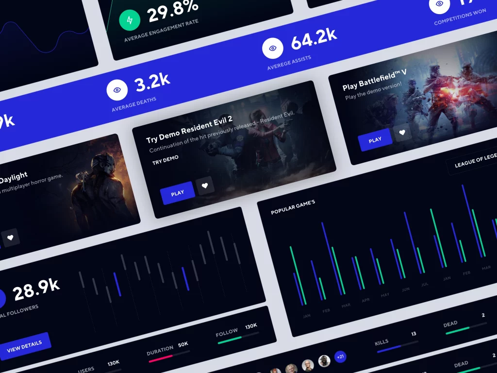
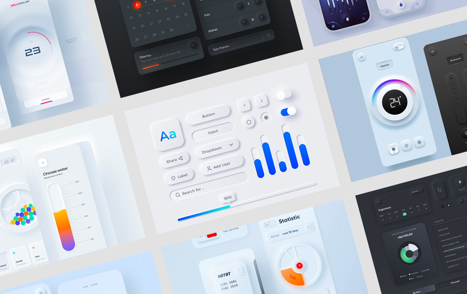
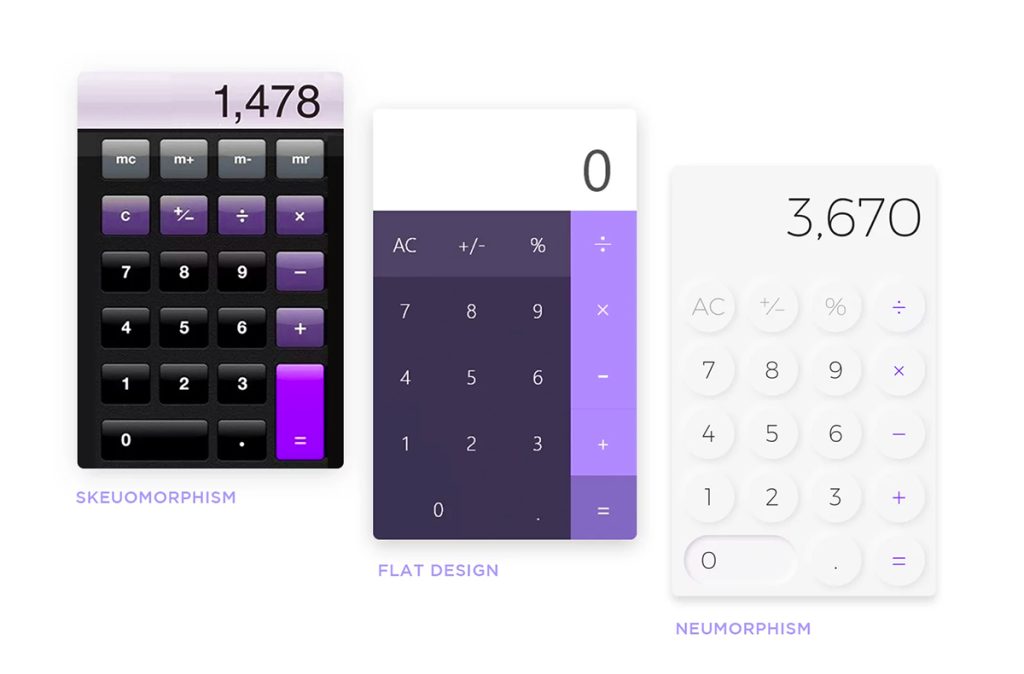
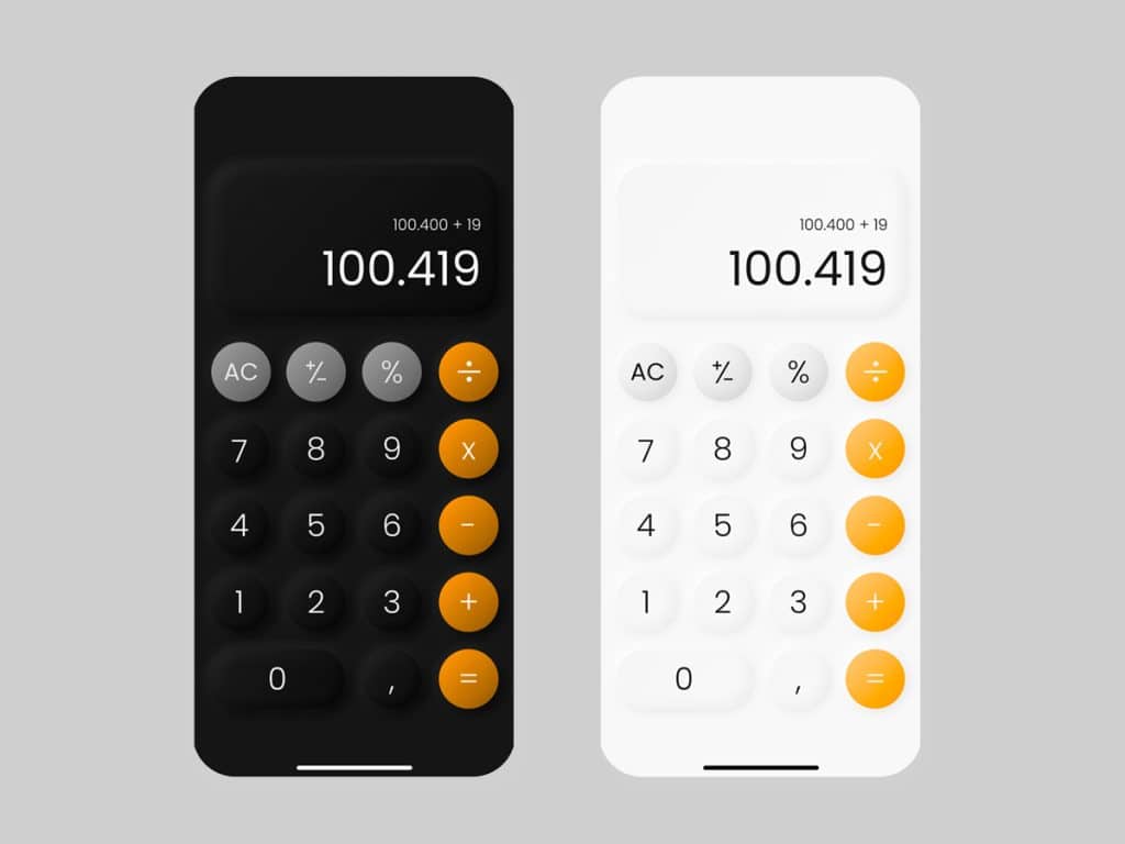
Today is about one of the latest design styles that got a lot of attention lately called Neumorphism. It originates from Skeuomorphism, an early adopter trend that Apple used in the early days before flat, material, and minimalist design became popular. Before we dive in into the actual showcase of designs, I would love to explain in a few words about the history of these trends, how they propagate and what is fashionable today. Grab a cup of coffee and enjoy!
The concept of skeuomorphism was first proposed in the 1980s. Steve Jobs, the founder of Apple, was one of the first advocates that computer interfaces should be decorated to look like real-world objects. The concept is simple: users should find computer interfaces much easier to use if they are designed in a skeuomorphic manner.
It was beneficial for individuals who had never used a computer since the association with natural objects made identification very simple.
Mac OS X 10.4 “Tiger”
Even now in 2023, this style is still present in some components of modern applications. For instance, the trash icon on your macOS as Michal Malewicz explains it in his wonderful article or the well-known floppy disk we love using it when we want to save our progress.
macOS Monterey
But, what this weird word means anyway?
According to Wikipedia: “A skeuomorph is a derivative object that retains ornamental design cues from structures that were necessary for the original.”
A plain definition would be that it mimics details of the real world.
We can use our imagination and tools like Photoshop (this would go very well in this case), Figma or Sketch to transfer the decorative details of a real-life object into a digital interface. There are some talented artists who use Skeuomorphism in their work to create intriguing designs. Let’s take a look at some examples:
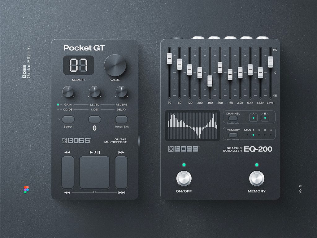
Another Guitar Effects Shot by Mik Skuza
UI Kit by Mike Creative Mints
iOS Game / Match3! by Mike Creative Mints
The result is beautiful thanks to the attention paid to every detail. Designers go beyond the call of duty in designing every element, to look exactly or very closely to match a real-life object. This quote sums it up nicely:
The details are not details. They make the design.
Advantages using Skeumorphism
Immediate recognition because of its realistic approach
Creativity meets no boundaries
Feedback – for instance an audible signal is generated when you throw something into the trash
How on earth will I implement this?
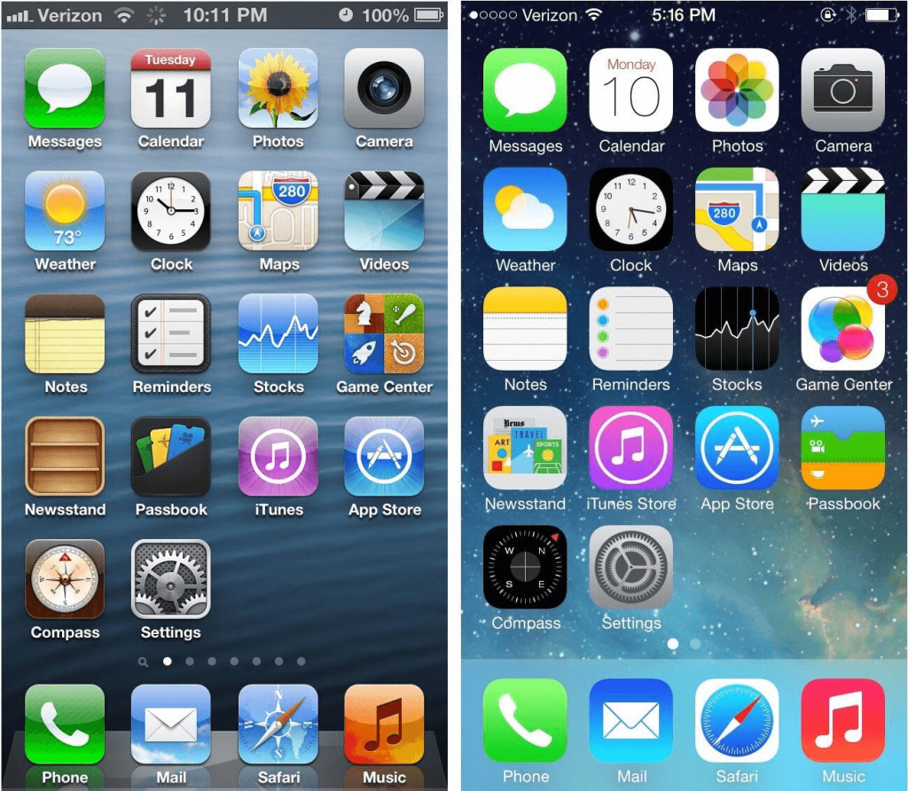
Indeed, that’s the main disadvantage of using this style and that’s why it went outdated. People start questioning, do we really need all that? The most visually drastic transition occurred in 2013 from iOS 6 to iOS 7.
Photo credits go to the respective owner/s
Advantages of Minimal Flat Design
Coding time has been significantly decreased
The actual code was also refactored
The storage on the server was reduced
In this article, we will explore some examples of Neumorphic UI designs and get inspired by them so that you can start combining old and new elements in your own creative projects but before that:
What exactly is Neumorphism Design?
Often called modern skeuomorphism this design trend falls somewhere between skeuomorphism and flat design. It does not act by miming features of natural objects nor by reducing their details to a minimum. This example from Justinmind illustrates it the best:
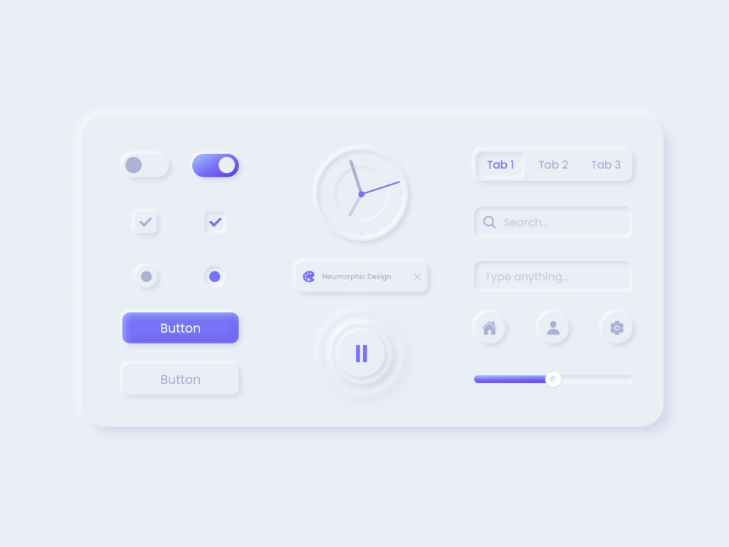
A neumorphic design provides a unique user experience and visually appears as a soft interface with drop shadows, depth effects, and a vibrant primary colour, all of which work together to create this cool aesthetic.
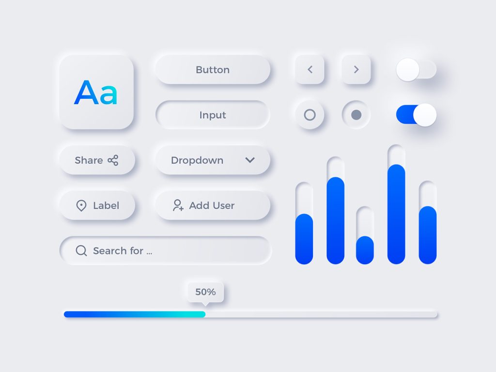
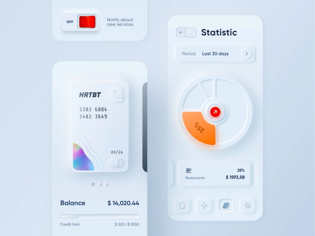
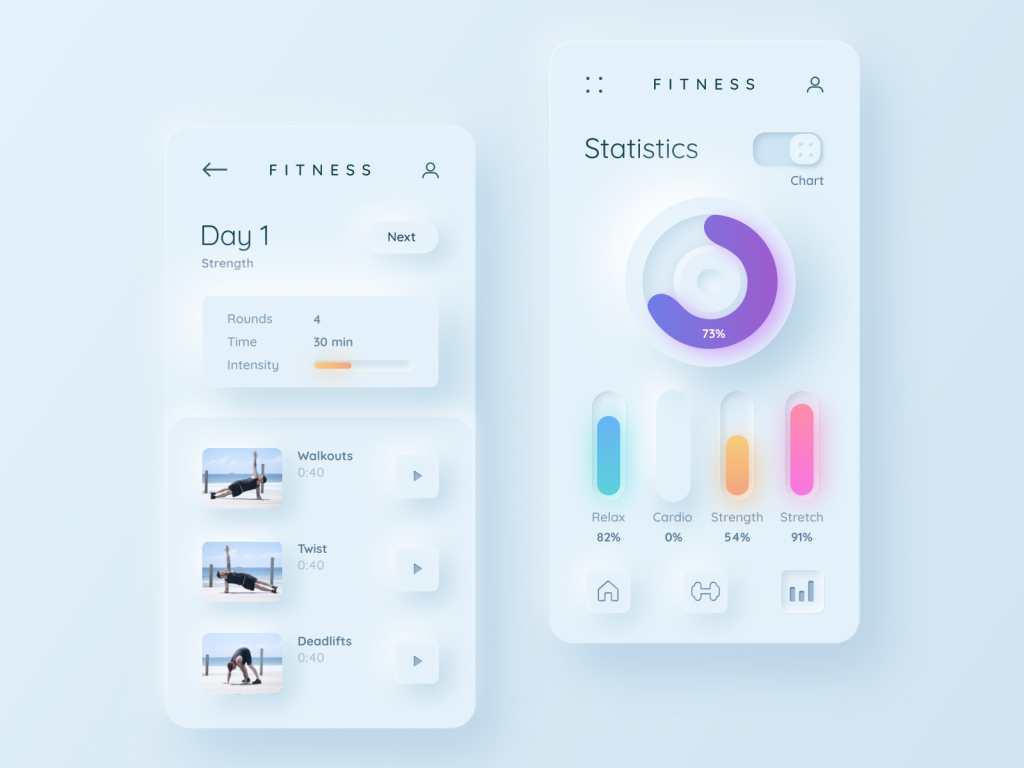
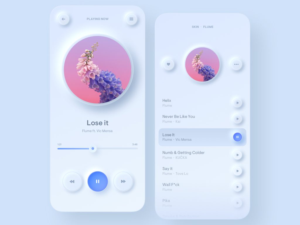
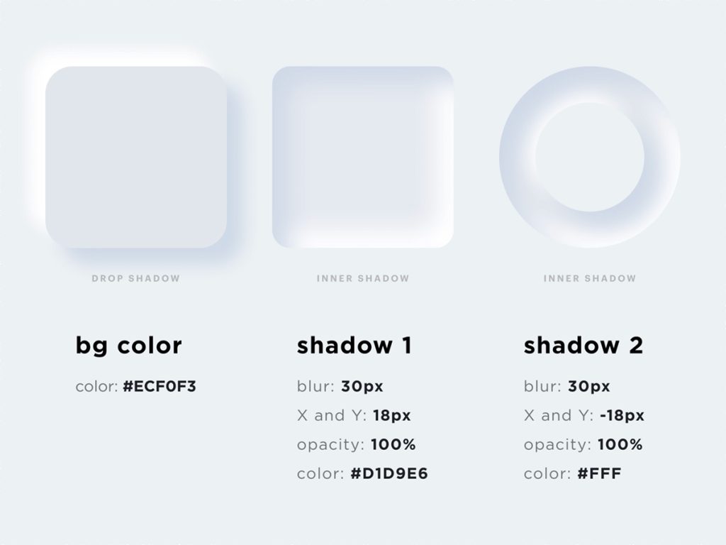
Here is a wonderful freebie containing multiple components wrapped in neumorphism. Let’s analyze it a bit:
Mike Denzel
The background of the card and the artboard’s background share the same neutral color, and the two shadows, one lighter and one darker combine to give the impression of a 3D scene.
On the entire interface, one accent-primary color expresses a professional aesthetic.
A major role is played by the in-depth effect applied to many components—for instance, the square and the circle.
I know what some of you are thinking: Yes it is all wonderful, but I think this UI style is not applicable. How many apps have you seen under neumorphism ? Well, I think if you want to be unique and make your app stand out in this noisy world, you can give it a try.
My advice is to not go very aggressive with it and make components very subtle, clean, and simple. You can use this css free tool to implement a neumorphic design.
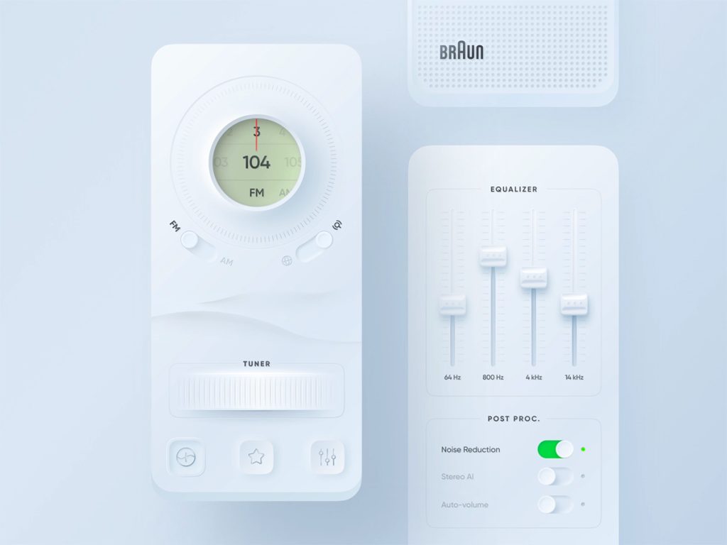
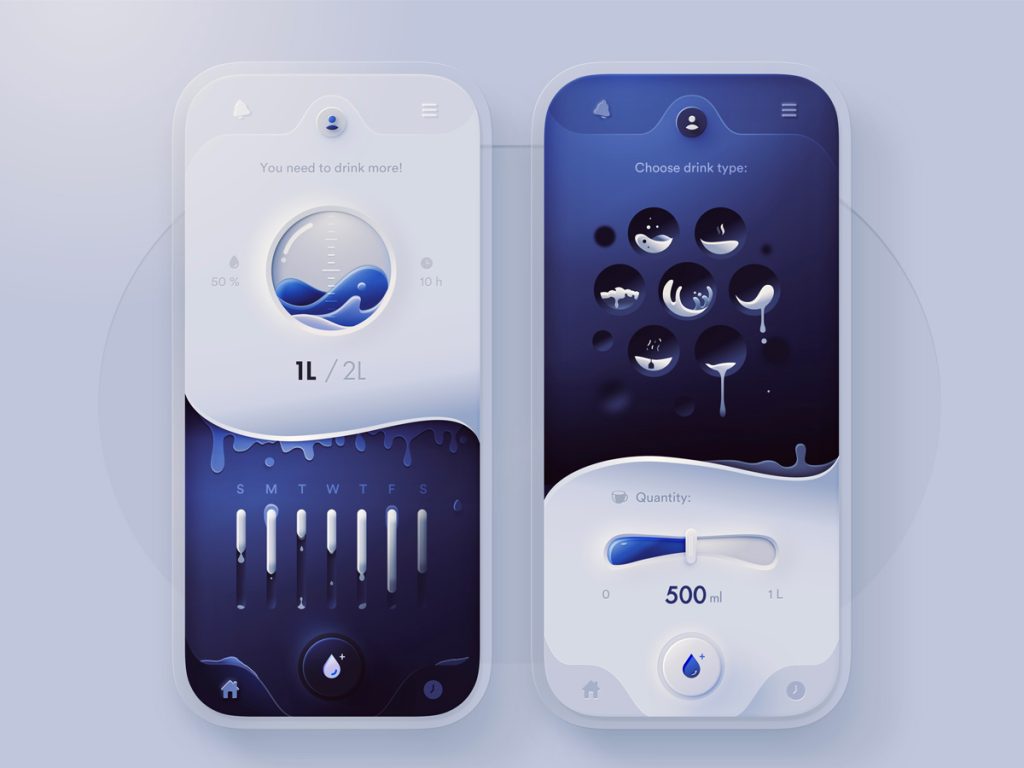
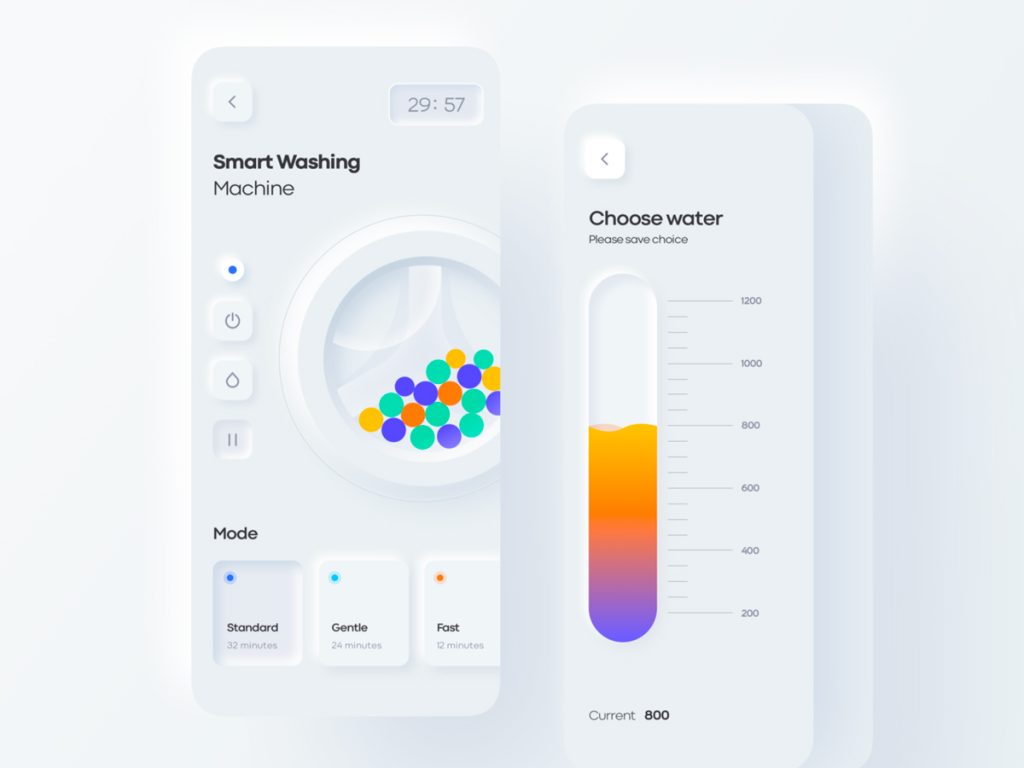
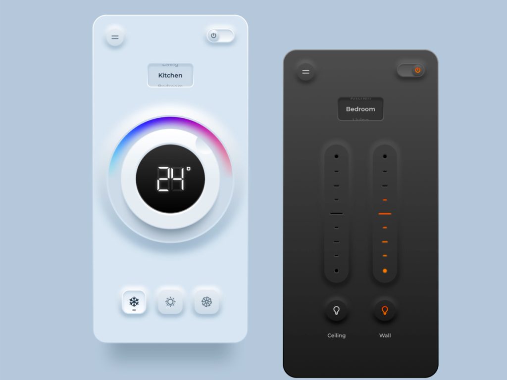
Without further details please welcome a collection of very carefully handpicked design shots under neumorphic style from designers around the world.
This shot became viral on Dribbble very quickly, starting the neumorphism trend. Many designers immediately began applying this style to their creative work after seeing it.